Realization of storymap, maps, charts and infographics to describe the condition of children in Italy
Who we worked with
![]()
Services
Solutions
 Project for Save the Children Italy
 Save the Children is a non-governmental organization founded in 1919.
It is one of the largest independent international organizations. It’s on the ground in 120 countries with a network of 28 national organizations and an international structure (Save the Children International).
Save the Children’s activity in Italy is focused on: fighting educational poverty, health, emergency response, protection from abuse and exploitation, tackle poverty and food security, strengthening systems protection of children’s rights and participation, supporting unaccompanied migrants minors in Italian.
The main campaigns of Save the Children concern the reduction of poverty, the fight against child mortality and the defense of the poorest children in particularly poor context, such as migrants and refugees; the most excluded and marginalized, such as the disabled, girls or ethnic and religious minorities. It is also very committed to promoting the policies that protect the rights of children and adolescents.
 Customer needs
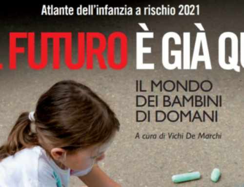
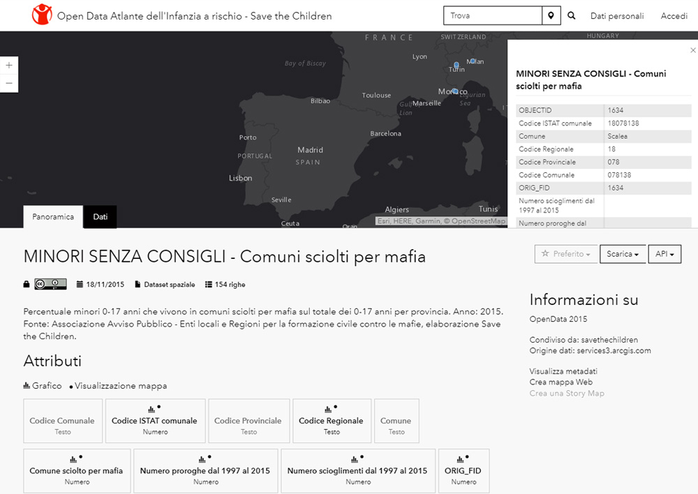
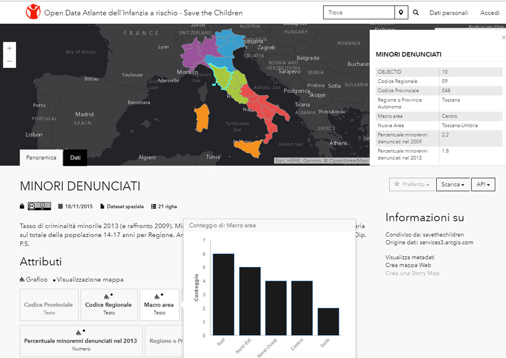
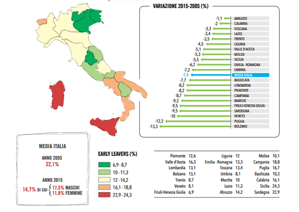
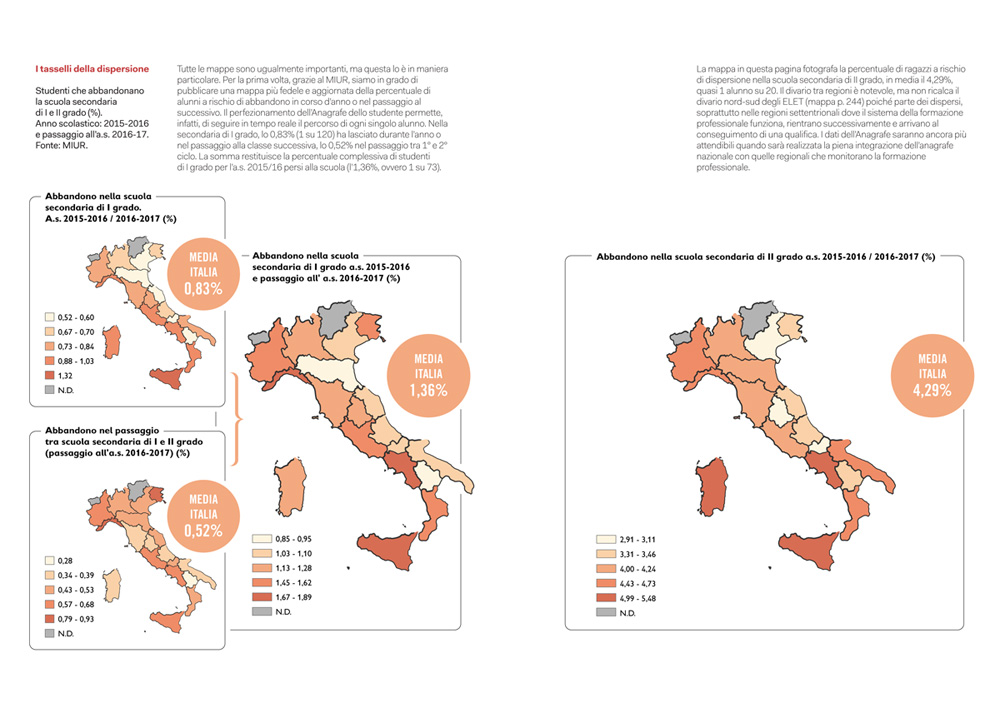
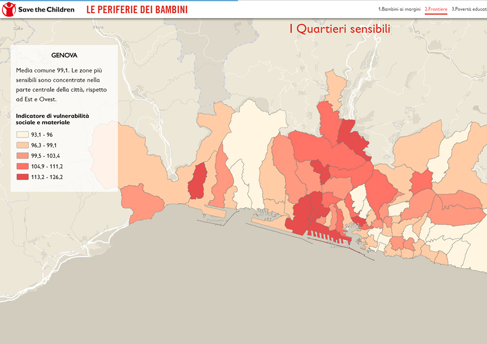
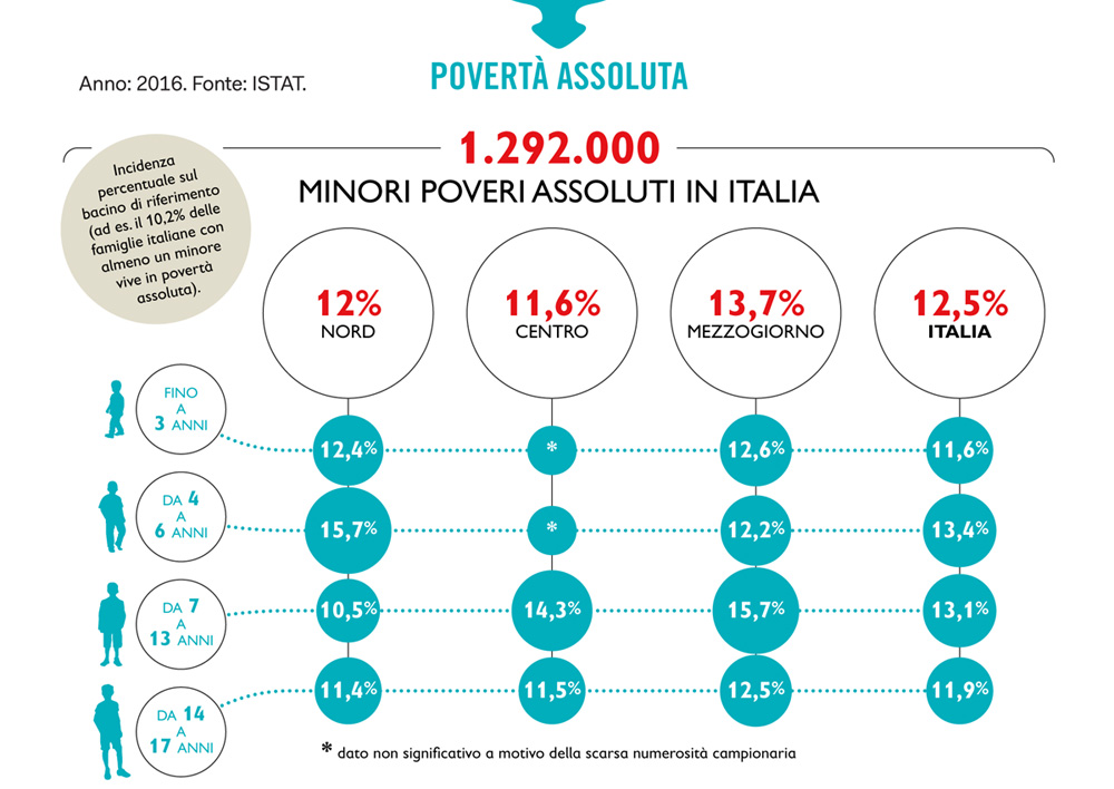
Every year Save the Children Italia dedicates an Atlas to the Childhood at Risk in Italy in which it analyzes, using data collected from authoritative sources, the condition of minors in our country. Every Atlas is focused on different subjects that change from year to year. The Atlas contains a large variety of data and indicators that Save the Children has the intent to present in a communicative way, especially through maps, infographics and graphics.
The necessity is therefore to show an analysis of the territories and the geographical differences that may occur to depict the situation of the childhood.
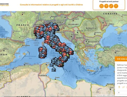
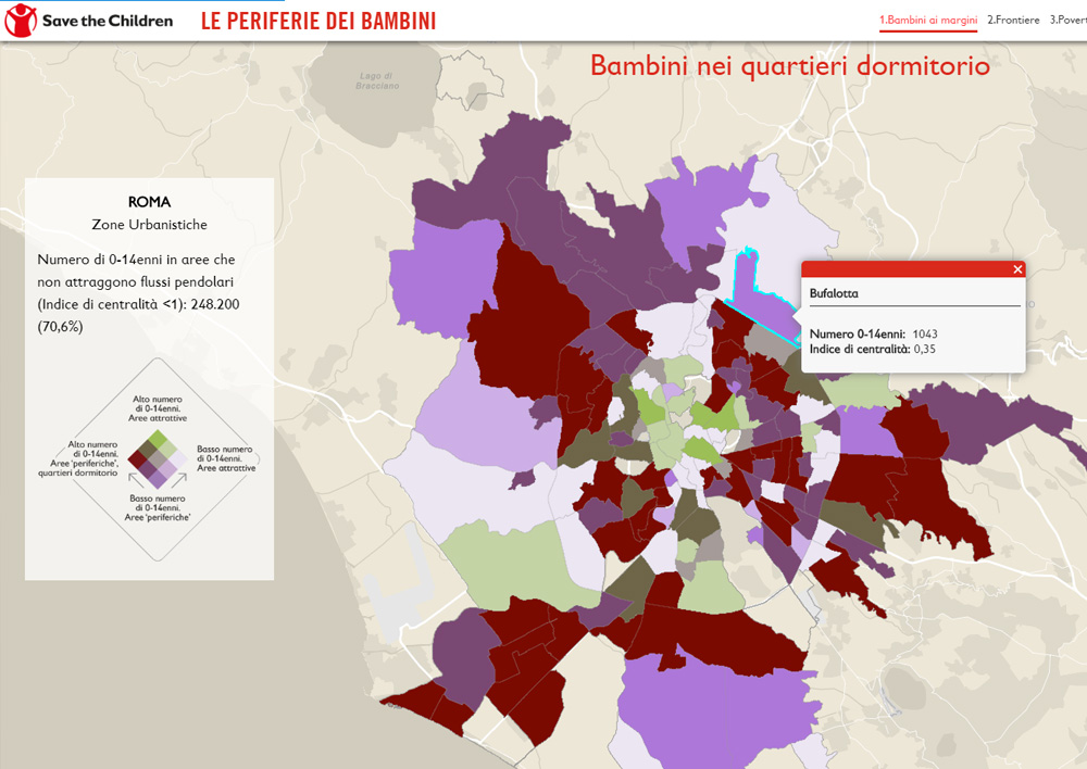
 Solution: Story map for disseminating information
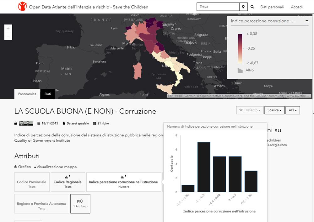
By using specific GIS tools, it is possible to perform various types of comparative analysis on data. As a result it is possible to have a new and complete view of the phenomena we want to investigate. The color scales and the symbolism of the maps are a tool of great support to communication. Infographics are also based on data: the communicativeness of these representations, the simplicity of distribution and the design greatly simplifies the communication of information processes.
 Benefits of the Story map
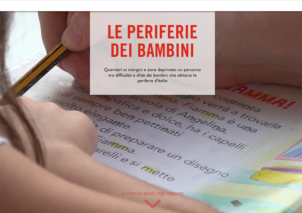
Maps, graphs and infographics allow to communicate data or phenomenon in a clear way to a wide audience. Reading a map is easier and more immediate than understanding the data shown in a table. This type of graphic support makes the multiplicity of information you want to present pleasant and non-trivial. The GIS software with which the maps are ebaborated also allows to cross-reference data sets in order to obtain new useful information for the analysis of a phenomenon. All data and maps collected are usually organized as Open Data and made available to everybody. This favorable action permitte a large-scale spreading of information, easy consultation and download for further processing, studies, and reports drafting. Every year an extract from the Atlas is disseminated on web as a storymap that integrates texts, interactive maps and images of the Atlas.
Notes
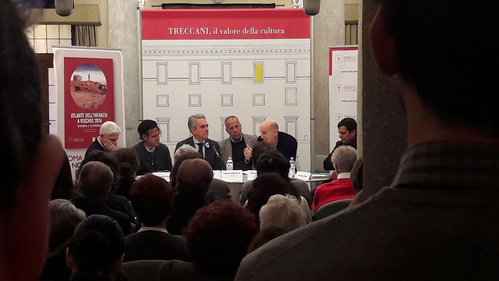
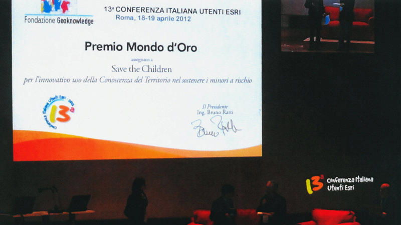
The Atlas of Childhood 2011, created for the first time with the technical support of gisAction, won the “Mondo d’oro” award at the Esri Italia Conference in 2012.
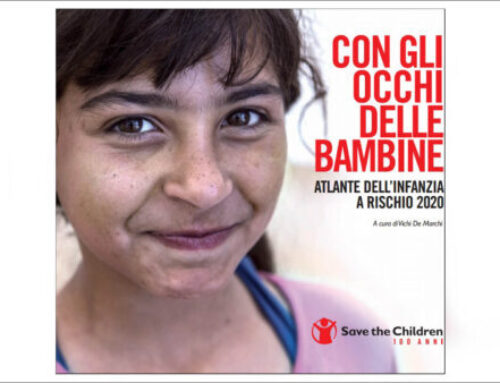
The Childhood Atlases 2016, 2017 and 2018 are published by Treccani.
- Edition 2017 > “Lettera alla scuola”
- Edition 2016 > “Bambini e supereroi”